
In the digital era, charts and graphs are the most important tools to represent any data or development. Visual data has always had more impact on people and it is very easy to spot trends or predict future movements through a chart.
Why charts are needed?
A large amount of data is being created online every minute, however data alone does not provide much insight or interpretation of the matter. Organized data, defined as information, is used by analysts and leaders to make decisions and rapidly identify trends.
This is where charts come in. Charts aren’t new to the block and have been used for a long time for technical and statistical analysis in the finance department of most markets. Even though the amount of data might be overwhelming, reading cryptocurrency charts is not exactly rocket science.
Here are 5 charts to know your cryptocurrencies
Line chart
If you have just started investing in cryptocurrencies, this is the chart you should be following. The line chart is the simplest chart to follow as it shows just the closing price of the currency over a set period. The ‘Line’ in question is just what is formed by connecting all the dots. This is the chart with the least noise and hence it is very easy to spot trends in this particular chart. Line chart is also preferred by investors as it provides the closing price. The line chart thus presents a better benchmark for trend-spotting.
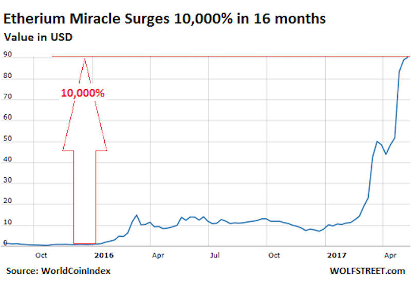
Line Chart representation Source: WorldCoinIndex
Scatter charts
These charts are almost not used at all in cryptanalysis. It is basically a line chart minus the line. One simple advantage is that trends can also be spotted easily here by observing the density of points in a particular area. This is the most basic of charts and is barely used in something as information heavy as cryptocurrencies.
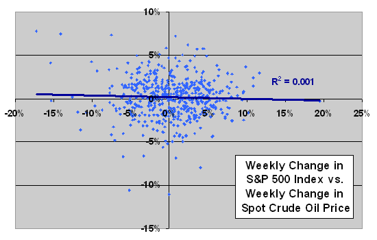
Scatter chart. Source: evilspeculator.com
Also read: The Crypto Market Rebounds Back: Top Coins to Watch Out For
Bar chart
Bar charts are a simple extension of the Line chart. It lists the opening, highest hit, lowest hit and closing over a given period of time. The vertical lines represent the price range (opening price – closing price) of the currency and the horizontal demarcations represent the opening and closing price. In addition to all the given information, the chart is also easier to read because it is colour coded. A rising period is denoted by a black shade while a falling period is coded red.
The extra information given by the bar chart in a concise visual manner is a reason why a lot of investors choose to read the bar chart instead of the line chart.
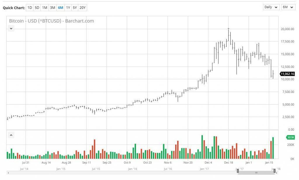
Bar chart. Source: gymx.fuxion
Also read: If you are an absolute noob at reading charts, here is a starter: Bitcoin and Crypto Technical Analysis For beginners
Candlestick chart
The candlestick chart is a very popular chart amongst traders and investors alike. The chart focuses on short term outlooks ( 8 to 10 trading sessions). However, of all the existing charts, the candlestick chart is considered the most complex chart to read.
A thin, vertical ‘candle’ like figure represents the price range. This chart too is colour coded depending on whether the stock closed higher or lower than its opening price. Currencies whose value has fallen is represented by red while the ones where the value has risen is coded white or clear. The length of the rectangle depends on the range of open and fall. Hence, on days when the opening and closing price are the same, the candlestick has no body.
The charts given above are the ones that are widely used. Traders and investors seldomly use any other type of charts.
However, the following two charts do exist and one should definitely know how to interpret them.
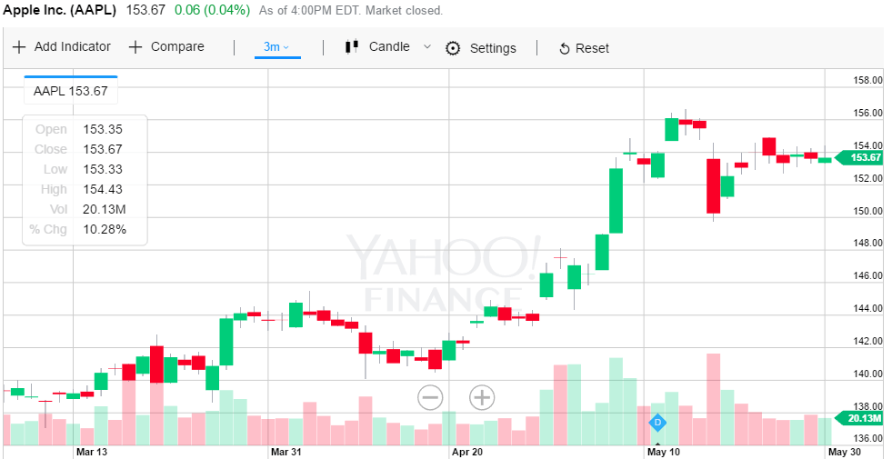
Candlestick chart. Source: appreneurinvestor.com
For a greater view on technical analysis : Chart types
Point and figure charts
This is not a very popular chart and is hardly used by the average investor. However, these charts had been used a long time back during the time of the first technical traders. The chart simply reflects the movement of price without reference to time. While this may seem like a disadvantage for referential purpose, it removes a lot of noise ( insignificant price movements). This helps in spotting overall trends.
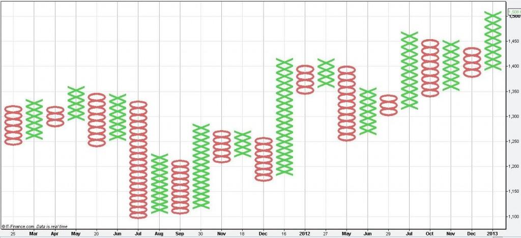
Point and figure chart. Source: Binary Tribune


Will cryptoassets gain back its popularity?